.png)
The last bit of process for my final paintings. I’ve outlined the house forms in the blue. Some of the lines weren’t the same thickness, but I think this accentuates the illusion of shadows. I painted them in a solid cream colour to rid of the white, as I think this was too harsh against the soft pink.


Next, I wanted to add texture, as it currently looked like a flat painting, and wanted sensory connections to reflect the all the senses that are triggered within rural environments. I used the side edge of an oil pastel; which coarsely fought with the canvas texture, and made a lovely, irregular pattern that reminds me of house rendering, or derelict buildings. It’s an even way of adding detail, without the imbalance of a definitive line.
I also made sure to colour the side of the canvas, (similar to Gao Hang), to accentuate the idea of being lifted off the page, and representing a flat yet 3D understanding of the landscape.
Finally, I wanted to add a 3D element to the piece. I have always wanted to work with plywood. There is something about the appearance and thin cut that gives the impression of a 3D turned 2D material. It gives the impression to me of a playful material. With the laser cut, I can achieve whatever shape I can design, with a perfect finish.
For this reason, I’ve used it to protrude specific areas in the piece, such as the door, and a selection of plants. Because of the refined and irregular cut, it visually reminds me of a collage aesthetic, which was my intention!
I'm missing more historical context for my work, as I think I need to know the origins behind my context and materials, that would give further understanding to my chosen subject and the style I've developed over the years.
Capability Brown
Lancelot 'Capability' Brown was a prominent 18th-century landscape designer, entrepreneur, and salesman in the UK. He developed the nickname 'Capability' from his common descriptions of country estates having great 'capabilities' for improvement. By convincing clients of this potential, he managed to work on numerous projects simultaneously. Brown redesigned hundreds of parks and gardens across Britain, being largely responsible for the the natural-looking, English landscape style we see today.
"His style came from the three practical principles of comfort, economy and elegance. He designed landscapes on an immense scale, which provided a setting for mansions which were surrounded by woodland, parkland dotted with trees and carefully contoured ground. His landscapes also incorporated serpentine shaped lakes and carefully designed architectural features including follies, temples and bridges."
(Oliver Cox, 2024, https://www.nationaltrust.org.uk/discover/history/people/who-was-lancelot-capability-brown#capability-browns-story-in-brief)


Capability Brown Gardens
Matthew Bullen. Chatsworth House [Photograph].
Harewood House. Harewood House [Photograph].
Hubble, John. 2021. View of the House at Croome in spring [Photograph].
Henri Matisse
Matisse had a decades long career as a painter, sculptor, draftsman, and printmaker, and is redeemed as one of the most influential artists of the 20th century. His stylistic innovations of changed the course of modern art, emerging as Post-Impressionist, he was known as being a leader of Fauvism, meaning les fauves, translating to 'the wild beasts'. It is characterised by strong colours and fierce brush work. Matisse was one of the greatest colourists of his time, using it as a foundation for expressive, decorative, and monumental paintings.

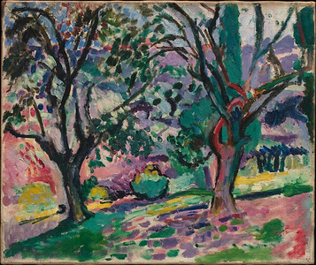


Matisse, Henri. (1906?). Olive Trees at Collioure. [Oil on canvas]. The Metropolitan Museum of Art, New York.
Matisse, Henri. (1952). Standing Blue Nude. [Oil on canvas]. The Metropolitan Museum of Art, New York.
"Celebrated as both an orchestrator of tonal harmonies and a draftsman capable of distilling a form to its essentials, he long sought a way to unite colour and line in his work."
(MOMA, 2024, https://www.moma.org/artists/3832)
I've decided to use 2 canvas for the final show piece. I think this is another way of expressing a narrative, and the 'comic panel' idea. I'll be painting one large painting, but across both canvas. I hope to express a narrative, capturing different lens of the landscape, as if turning on the spot to have different perspectives (Like a small panoramic view).

I've drawn initial ideas in my sketchbook, thinking about what kind of landscape and perspective I want to show and the colour palette I want to use. I was flicking through a book I own about views and places within the Peak District, which is within an hour from where I live, being fortunate within driving distance. I saw this photo taken from Hartington in Ashbourne (Photo below). Something about the design and shape of the signal box, which was part of railway line, reminds me of a liminal space.
I used this photo to sketch the bottom left image in my sketchbook, which is what I'll be drawing across both canvas. Having a 'landmark' in my painting will give it a foundation to build on. It will be the focal point, and the landscape can be designed around it. This should structure the various elements from the onset, and create a balanced composition.
I like to imagine the landscape beyond the photo. Perhaps the path goes on for miles without reaching another settlement, and this is the only stop within the middle of nowhere. You're dropped in an unknown location, surrounded by miles of overgrown countryside. The thought parallels a real location in Japan, Seiryu Miharashi station. It can only be reached by rail, and was created solely as a viewing platform to appreciate the scenic views adjacent Nishiki river.


Whiteman, R. and Talbot, R. (2003). The Peak District. London: Seven Dials.

My painting shows a duplicate shape of a house façade. The overlap is intentional, which plays with the composition, and idea of depth. It's meant to give the suggestion of the building from an angle, but as if the side façade isn't there. The shape is intentionally vague to encourage individual interpretation through universal familiarity. What experiences does this little landscape remind you of? Either side of this building is representations of trees and other nature, to emphasize the dense and surrounding environment.

This is my first phase of painting on the left panel. I wanted irregular shapes, so drew the tree form growing at a side angle, with some odd protrusions to suggest branches. I chose a soft colours for the background. The petrol blue/grey represents a looming storm cloud, and the pink suggests a dusk sky. I enjoy this juxtaposition, as you don't normally see them together. I'm trying to create an otherworldly yet familiar landscape that marries real with possibility.

This is the first stage of the right panel. Currently, I really like the work just as it is, as there is still structure and a familiar outline to the piece. I like how incomplete it looks, especially as the lines remind me of painting by numbers. The marrying of painted shapes with thin, drawn outlines gives the impression of a dream unfolding, and leaves even more room for interpretation. I chose to outline the house in a dark blue, suggesting darker areas where light hasn't hit the building.
My next move will be painting the rest of the building outline, and potentially adding detail into the solid shapes.