.png)
- May 4, 2024
As mentioned, Gao Hang is an artist who uses my interest in 90/00's video game art. He is known for his raw, unfiltered portrayal of digital graphics, reflecting the awkward yet captivating essence of early video game imagery. Hang's art is not only a critique but also a celebration of the digital world's influence on modern culture and aesthetics. He uses humour and absurdity to invite viewers to reflect on the invasive role of technology in shaping perceptions and experiences.


I love Hang's playful approach with these graphics. As time has passed, they are seen by some as a visual language for comedy, due to their absurd design which creates silly expressions.
I love his choice of compositions too, which zoom into his subjects to the point of invasion. It's like a screenshot or render from a game, where the player enters 'photo mode', taking on a first-person perspective, and plays God whilst time stands still, wandering around the open world without any consequence.
This creates the impression of freedom and control over the artwork, yet it clashes with the impact of the close encounter, due to the size of his works, which feel otherworldly. I enjoy these juxtapositions, as they reflect how we can simultaneously experience opposite emotions and actions.

I also love Hang's full usage of the surface material, as shown here. He uses the flat, smooth dimensions of the material to give the illusion of a physical low-poly object. This is achieved by painting the surface sides, which is deep enough to give the impression of an actual card, but as if created within a 1990's video game. The illusion is slick enough to hide the actual material, and makes it even more believable that it's an object not of this world. It turns the flat, 2D representation of a card on panel, to a tangible, larger-than-life object. A simple, yet highly effective detail.
I will be using this detail in my next works, which should help to 'lift' them off the canvas or surface, and give the illusion of a portal into another world.
"Airbrush has been a favoured medium for years, but this time, he’s cropping so close onto objects that face and form are lost almost entirely to the mapping rendering flaws you’ll find on most early 2000s video games – maybe you’ll make out an ear, if you’re lucky. Gao has always liked the “ridiculousness” of these flaws, and how it proves the human hand in gaming development."
It's Nice That, 2024, 'Gao Hang gets really close up to video game characters, then paints them', (https://www.itsnicethat.com/articles/gao-hang-you-see-you-are-also-simulated-art-project-140524)
Airbrush is the perfect medium for Hang is explore these aesthetics, which also gives a dream-like quality, which is soft like clouds.
I quickly wanted to explore this medium, so I used the app Procreate to make a digital painting using airbrush. The perfectly soft edges are great for perspective, as of looking without glasses. I love the idea of breaking down reality into basic shapes, colours, and skeletal elements to evoke a experiential memory. Will definitely be using this in future pieces.

I've created a very abstract representation of my back garden, using the airbrush to represent background trees behind the garden fence. The yellow represents the fencing slats, and the skeletal red shapes are the patio tiles, as if hovering, but sequential to give the impression of going somewhere.
Feedback
Fellow artist Becky had these words to say about the piece:
"Green plants/trees, yellow castle wall and red books flying across the page."
Partially seeing my vision, I still enjoy her take on the piece. Even though it was a quick sketch, I love seeing what others think of my work, as it is interpretive, and stimulates the brain into creating a world from your own experiences.
References
It's Nice That, (https://www.itsnicethat.com/articles/gao-hang-you-see-you-are-also-simulated-art-project-140524)
L21 Gallery, (https://www.l21gallery.com/artist/gao-hang/)
It's Nice That, (https://www.itsnicethat.com/articles/hang-gao-art-050221)
- Apr 29, 2024
Feeling fresh from my research and sketchbook drawings, I’ve started making sculptures in ceramics with white earthenware, as I want to translate my ideas in a tangible artwork. White earthenware is the equivalent of a white canvas, so the attention can focus on the shape and quality of work, and then possibly any mark making on top (If I choose to).

Using simple shapes, lines, and textures, I want to capture the essence of the British landscape, inspired by the many locations I've been lucky to visit. For me, a squiggled line represents many shapes in nature, whether tree trunks, branches, pine needles, grass, the shape of the horizon, and more. This is why I feel illustration is the perfect medium to explore the landscape, as the artistic potential is boundless.

Using this idea, I'm making squiggles in a three-dimensional form, ensuring I capture a specific line quality, looking at the balance of thickness, shape, and consistency. Like my drawing above, the tree on the right I enjoy, due to the sharp back and forth of the shadows in black pen, full of spirit, yet contained in their individual spaces - a balanced composition.


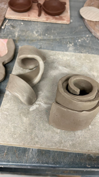


Ceramic WIP
My favourite here is the left photo, the singular squiggle, like a rollercoaster doing loops. Again, I think the balance is right, with the rounded loops riding into the sharp, connected kink. I also enjoy the solid circle, rather than cutting out a hole, which reminds me of collage, cut-outs. As if I've intuitively cut out the shape with scissors.
My least favourite is the right image. This was spontaneously cut, but has no flow, having multiple connecting points. It seems to resemble a pretzel - not what I was going for! I decided to cut away right 'arm' (See below), and use this piece, which reminds me of a broken ceramic piece. (Perhaps think about this when choosing to glaze it). See some further visual inspiration/artists below which inspired me.


In my sketchbook, I've fleshed out some ideas of what my final ceramics (For exhibition) may look like. I think my drawings have a connective quality, as different parts that are coming together. I've achieved this through attaching individual elements onto a seamless adjoining line, which gives the illusion of a hybrid creation. See the purple edits underneath, which I think help create this illusion.
I'm now waiting for the pieces to be fired, and then will decide on what glazes.


- Apr 27, 2024
Whilst in Cornwall, I visited St. Ives and the Tate Gallery. I loved the focus on local and art history within the area. I documented my two favourite pieces in my sketchbook, by Margaret Mellis and Ro Robertson.
Below is Margaret Mellis' work, 'Number Thirty Five', 1983, a wall sculptural that was made from driftwood along the beach. To best describe why I love this, sculptures like this I see as evolved paintings on canvas. It's as if the elements have come to life in abstract, three-dimensional forms, representing the seaside landscape as experienced from a human perspective.
Moving to St. Ives in 1939, Mellis was a constructivist, but seemingly a Modernist in the latter half of her life. She worked with driftwood in the last 20 years of her life, gathering found materials from the shoreline and adding them into her home collection.
Personal Thoughts and Take-away
Abstract representation of landscape
Feels memorialistic, as if assembling a structure to create a memory, or honour a place
Physical interpretation of a landscape painting
Uses found, local objects to create a collage artwork. I feel more connected to this piece, than compared to a traditional landscape painting of the same shoreline; owed to her sensory choices of material, literal signifiers, and the raw aesthetic. All of this can be down to her Modernist practices.
"A rejection of history and conservative values (such as realistic depiction of subjects); innovation and experimentation with form (the shapes, colours and lines that make up the work) with a tendency to abstraction; and an emphasis on materials, techniques and processes."
Tate, 'Modernism' (https://www.tate.org.uk/art/art-terms/m/modernism)
My second favourite piece was Ro Robertson's 'Interlude'. Cor-ten steel in marine paint and found nylon rope. The piece is a response to the tidal zone of Porthmeor Beach and the changing shoreline between the headlands of the Island and Carrick Du. Interestingly, she has appraoched the landscape through the lens of LGBTQ+ experience, saying “We are part of a diverse, natural world in constant flux where boundaries aren’t binary and rigid but rather flow in constant harmony”. (Robertson, 2024)
I love their idea of adding layers of personal experience when imagining the landscape, as I feel this adds value and soul to the artwork. You also see the world around you in a different light, and can learn something from it.
In terms of the artwork, I particularly love Robertson’s use of flat forms that are cut to suggest fluidity, and flow into one another effortlessly, directly reflecting the crashing sea waves. I love the hints of colour, painted with blue colours of the sea, and pink suggestive of a dawning sky. This looks better than if they were painted solid, as it adds textural values, and similar to Mellis, exposes the raw material, and creates a collage aesthetic. They aren’t trying to hide the material, wanting to show a rawness that reminds me of old ships in a dockyard, and the breezing scent of seaweed. The structure suggests circular motion, as if matter revolving around an energy source. It also displays its weathering from rain as it is rusted, again, a visual reminder of where it is from, and suggesting Robertson’s artistic processes and choices.
Personal Thoughts and Take-away
Bring textural elements into my works. Work with the raw material, and explore collage, through varying materials
Use sensory and emotional connections as forefront to explore landscape, as this is what makes you passionate about it!
Explore sculpture more as a medium through materials other than ceramics


Other pieces I loved include a large work by David Hockney. I enjoyed his choice to visually show dimension by painting the tiles. But also his fresh colour palette of fresh leaves (teal green), and candyland (bright pink). Feels reflective of the location in his title ‘Man in Shower in Beverly Hills’, 1964.
Also, ‘On Reflection’ by Patrick Hughes, 1975-78. A minimalist but effective method of conveying dimension and the calmness of the sea. This piece is owed to the grand scale of the work (122cm x 243cm).