.png)
- May 9, 2024
On my first canvas, I want to utilise all my research and create a tester piece, that will allow me to get a feel of the canvas and acrylic paint. I instantly know I want to paint a pixelated tree, a simple symbol of nature.

I‘m using the same concept as ceramics, a simple line to suggest the shape of a tree, but also should suggest a path, or journey within nature. The pixelated lines could appear as a road, or footpath, around the tree, or through the drawn landscape.
The grid paper I've used within my sketchbook is too small, as I want stronger, more graphic aesthetic. So I used a pixel website and Adobe Illustrator to mock-up the pixel size, shape, and scale of the tree. This rough shape I am happy with. The quality of line is thick enough to signify pixels, but small enough to achieve abstract detail.


I’m very happy with this shape. Each attached corner has a small excess of paint, which brings together the shape as a whole, rather than just sitting point to point. The left-half, particularly the bottom-half, sags slightly, which I enjoy. As I mentioned, it’s a combination of authentic and abstract representation, as trees are all uniquely shaped, and suggests movement.
I chose black as I wanted a sharp, graphic aesthetic, but also to keep the attention on the pixelated graphics. I also enjoy the scale compared to the size of the canvas, which gives the impression you're standing on a hill next to this tree, and beyond could be a distant valley.

From this point I’m contemplating my next move. I'm thinking of testing a comic strip, which the tree would be the centrepiece. In my opinion, a comic panel format would be a relatable method of expressing narrative, when compared to a traditional landscape painting. Especially as nature concerns peaceful memories and mindful moments, comic panels would recreate this captured moments, like a burst-shot photography selection. This would also lean into my illustrative style, and authentically express who I am as a creator.
Summary
Paint next steps in a comic panel format.
Think about what the rest of the landscape will look like. With a comic format, it will be chopped up into different shots, perhaps be like a 360 view from the same spot?
- May 7, 2024
I've always wanted to work on a larger scale, away from sketchbooks and A4 pieces, which is usually my largest work. For this project, I want to go big, so I made some A1 canvas to test painting, and hopefully create final pieces for the exhibition.

I chose A1 as I can play with landscape or portrait options. I feel square, or any thinner, would be too restrictive, if I am painting a landscape.
I have always loved video games growing up. They were my escape into another world, into another story, and were my equivalent of a good book, or getting lost in the outdoors, depending on the game.


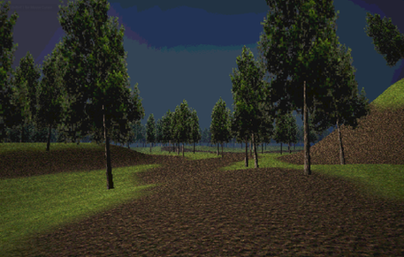


Low Poly / PSX Video game aesthetic
My favourite video games are low-poly graphics and textures. Restricted technologies meant developers were confined to choosing performance over realism. But these restrictions are now seen as nostalgic, and having ethereal qualities. I believe this is due to the sharp, contoured colours, almost abstract modelling, and contrast lighting, which reminds me of liminal spaces.
Game development of the 90s was technologically restricted, by including a higher polygon count (Number of surface areas on an object), then the frame rate would suffer resulting in choppy and slowed gameplay with delayed responsive times (Schneider, 2014). As Schneider best describes, "it's a visual style forced to make do with a limited number of polygons.". These artistic choices are being revived on a more mainstream level, replicated not just in games but also art (See artist Gao Hang in a further post). As Couture writes, many game developers of today are employing this 1990s aesthetic.
"The deliberate choice of a minimalist low-poly art style is a movement toward making the player use their imagination. It's a way of creating a visual style that simplifies and clarifies aspects of the game. It's yet another tool that lets developers keep a clear vision of what their game should be."
(Couture, 2016)
He also writes how the first time gaming was a big part of many people's lives, and any aspects that can touch on that like the visual choices, can create a pleasant nostalgia.
Take-aways
The trick to this style is:
Seamless gradients
Minimal, geometric representations
Contrast lighting
Play with these elements in future works. What kind of message are you wanting to convey? The ethereal qualities of these games are parallel to the emotions felt, and reasons why I love nature and the landscape.
Use this phrasing when talking about your work. Best explains your thought processes, and why you love these interests.
References
Couture, Joel. (2016). Why are so many devs employing a retro low-poly mid-1990s aesthetic? [online] Available at: https://www.gamedeveloper.com/art/why-are-so-many-devs-employing-a-retro-low-poly-mid-1990s-aesthetic-#close-modal [Accessed 25th April 2024].
Schneider, T. (2014). A comprehensive history of low-poly art, Pt. 1. [online] Kill Screen - Previously. Available at: https://killscreen.com/previously/articles/poly-generational/ [Accessed 25th April 2024].
Further Reading
Aesthetics Wiki (2020). Low Poly. [online] Aesthetics Wiki. Available at: https://aesthetics.fandom.com/wiki/Low_Poly [Accessed 25th April 2024].